Search

Hannah Walker

Month

January 2016

Research Portfolio

Before creating my website I needed to plan out my ideas for my site including: my logo, colour scheme, a mood board to generate more ideas, and decided on fonts that I want to use throughout my site. Doing this has helped me because I have come up with my own ideas for my site and it has also helped me put my ideas into my website. Here is my planning; shown below.
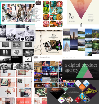
Mood board:
The first part of the planning was to create a mood board of already used images, that we have liked from websites we have found in the past. I chose to take images from few sites that I liked and remembered from previous research but I also looked for more portfolio sites and collected a few images from them- to give a range of images in my mood board. My mood board (shown below) includes various pictures that I like  and I think that I could use similar images on my site to the ones that are on my mood board.

The images I have put in my mood  board are images that have appealed to me from existing sites. They all seem to be very bright, eye-catching and colourful and also match the colour scheme that is on each of the sites (that each image came from.) I want to use a range of images on my site and so the ones on the mood board represent an idea of how I want my images to look.

Screen Shot 2016-01-25 at 13.06.44.png

Colour Scheme:
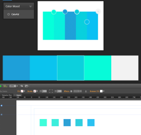
I have picked a colour scheme for my site after looking at many different schemes and different colours I could use. At first i picked a few that looked good and compared them and asked a few people for their opinions on each. After thinking more about how each scheme would make my site look and taking into account the opinions people gave me on each, I then narrowed it down to my favourite one.

Untitled

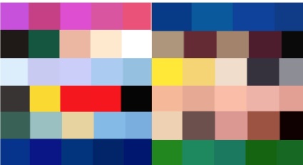
I chose this one (shown above), I think that this one looks attractive and will make my site also look professional and smart. The colour palette I chose represents my work in a professional way but also shows that I am serious about my work, as I have taken time to choose a scheme that will suit my site in the way I want it to.Website colour scale.png
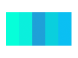
I think by using colours that are slightly different shades (in this case, various shades of blue/green), makes the site look good and also flow throughout. If i used a colour scheme with colours that don’t match and are random it would make my site look messy and very unprofessional- and so that is something I chose to avoid.

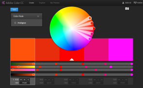
In order to add my colour scheme to my site I went online and opened up Adobe Colour CC, I then dragged the image of my colour scheme onto the website and it detected each of the colours that I want to use. I then swatched the colours on Muse to be able to use them when creating my site, and so the colours for my scheme will now stay on Muse for me to use whenever needed.
 Screen Shot 2016-01-25 at 13.54.23Screen Shot 2016-01-25 at 13.41.32

Font Styles:
Part of the task was to chose what font we wanted to use throughout our websites, after looking at different sites I narrowed it down to a few different styles. To find out what I want my text to look like throughout my site, I tried out a few different styles of text using Photoshop. Most of Photoshop’s styles are pretty smart and stylish and so I picked out a few of my favourite fonts and compared them based on how each would make my site look- either positively or negatively.

Screen Shot 2016-01-22 at 15.36.35
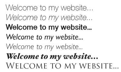
The ones shown above are the ones that i liked the most and there are a few that I was unsure on. I narrowed these down to my one favourite font- that I think will present my work and overall site in a formal way that will suit the purpose of the site.

Untitled3
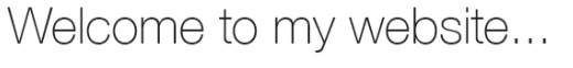
I didn’t want a font that would look childish and immature- as it wouldn’t make my work or anything on the site look good enough or professional enough for potential employers to be interested in. Also, I crossed the bold text fonts out as I didn’t want the writing on my site to be too outspoken and full on. I believe that the font I chose (shown above) will look smart and also represent my work well. It will also suit the purpose of the site whilst also making it stylish and attractive- and so that’s why I choose this on to use on my site.

Logo:
The final part of this task was to create my own logo for my site, I didn’t choose to incorporate my colour scheme with my logo as I didn’t want any colours to clash etc. The reason I chose to have a simple logo was so that it would be memorable and eye-catching, including my name also will help potential viewers (employers etc) remember my site and work. I am happy with my logo as it looks professional and eye- catching and I think that it will work really well with the colour scheme I have chosen.

HOSTING
In order to host my site I will research various websites that will allow me to host my site for free, or at a low cost. Some websites ask you to sign up before they host your site and so I will find the best hosting site I can/ most well known site, by finding out the cost for hosting on each site and compare a few sites- to be able to find a good one that I want to use. For my domain name I have decided to keep it simple and use “hannahwalkermedia”, this keeps my work and purpose of site looking professional and not immature in any way- to potential employers/ people interested in my work. For my domain/host (for example: .co.uk, .com, .me) I want to chose something easy for people to remember and also something a lot of people will recognise. I want to chose either “.com” or “.co.uk” because they’re well known and used across thousands of websites and they also suit the purpose of my site- keeping it professional. Another thing is that, my personal email doesn’t seem professional enough to use for my site and I wouldn’t want employers etc thinking I’m not serious about my work and overall site. And so I have created my own account personally for my work and to allow people who view my site to get in contact with me easily

COPYRIGHT
Copyright is a major issue to consider when collecting image, sounds and also protecting my own work. When collecting images or sound for example, copyright will need to be looked at for each item. In order to use an image you will need to know if it is copyrighted or not. The copyright law protects work, music, images etc from being stolen and allows you to control who uses your work. It prevents other people from copying your work and allows you to control what people can and can’t do with your creations. If you get your work copyrighted, it is then against the law for anyone to use your work without your permission. For me to find media that isn’t copyrighted I will need to research sites that do copyright free images/sounds/anything else that I would want to put on my site. There are many sites that provide copyright free images etc which makes it a lot easier for me to find images that don’t require me asking permission to use them. The copyright symbol is usually placed on the work to make it obvious that the work is protected and you aren’t allowed to use it without permission. If I do find an image (for example) that I want to use on my site and it was also copyrighted, I would need to get in touch with the owner of the work and personally ask their permission to use the image. If they allow me to use their work on my site then I will be able to use it. However, if they do NOT want me to use their work then I wont be able to at all. It would be against the law to use their work (if they don’t allow me to) and so I would have to keep looking for other, copyright free images instead. Certain web fonts have copyright protection put onto them, so I will need to take into consideration what type of font I want to use, and whether I will be able to find a copyright free version of the style I want. I will stick with researching copyright free fonts and chose one of those- so that I wont need to ask permission to use a font for my website. If I was to link another website in my site without permission (from the owner) I would be charged with copyright infringement and would mostly likely have to pay the owner a fee or fixed amount for using their work. I have decided that when trying to find: images, font, videos etc for my site- I will only use copyright free websites to get these from. This will make the process quicker and easier for me to create my site.

MUSE
Overall, I have found that the best ways for me to learn more about Muse and how to work the software would be to practice my skills on Muse in my spare time and watch the Muse tutorials that have been provided (by Andy) for me, to help me get used to the software and to develop my skills further. This will also allow me to get straight back to work once in lesson- creating my website quicker and applying the new/developed skills to my site. Whilst using Muse I will take screenshots of my site to show my development throughout.

WIDGETS:
A widget is usually a button, shortcut or display on a site that sometimes links to another page- containing more information on whatever the widget was displaying. I would like to try and find a banner widget that includes various social media etc, rather than having lots of single widgets. I think this will make it be presented better and also more organised. Another widget type I would like to find would be either a moving background widget- maybe interacting with the mouse/cursor movement. Or a slideshow of images for the center of the page, personally I find that they would make my site look really attractive and eye-catching and also memorable for the viewers.

Screen Shot 2016-01-25 at 13.34.12Screen Shot 2016-01-25 at 13.35.25Screen Shot 2016-01-25 at 13.45.27.pngScreen Shot 2016-01-25 at 13.34.21

Screen Shot 2016-01-25 at 13.34.40Screen Shot 2016-01-25 at 13.34.29Screen Shot 2016-01-25 at 13.34.04

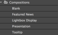
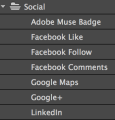
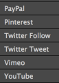
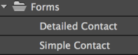
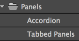
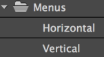
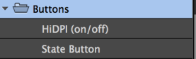
Looking at the widgets already provided on Muse (in the widgets library) has helped me come up with ideas of what other widgets I could find (online) and add to my site. I decided that I wont use the “social” widgets section as I want to add in other links such as my WordPress site that isn’t provided in this section in the widgets library. And so I will find copyright free images of the sites logos that I want to use and add them to my site and then hyperlink them to the sites that they match to. From the compositions part of the library I have chosen to use maybe one or two of the widgets just to display a range of images throughout my site, I haven’t chosen which ones I want yet as I might use them all (for different pages) although I know that I will definitely be using these widgets to show my work/images on my site. On my contact page I am planning on adding in a simple contact form (from the forms section in the library) as this wont look too over the top but also really professional too. I didn’t want to add in a detailed contact form as it may make my site look boring or people may be put off the idea of putting a lot of the personal details etc on my site/ the form and so that’s why I have decided to use the simple form. From the panels: Accordion, Tabbed panels, I think that I might want to use these in my resume section of my site to give a little more originally and also present my work well. However I want to look for others on the internet too to get a range of widgets to chose from when finally creating my site. Instead of using a widget from the menus section: horizontal or vertical, of the library, I decided to find a widget online (copyright free) that will suit my site and that appeals to me more than the ones provided. I think that the widgets I’ve found online seem to work more creatively and also suit my style of the site more and so this is why I have chosen to use these rather than the ones from the library. As my site doesn’t require these widgets I wont be needing to add them to my pages and so I wont need to use the HiDPI (on/off) and State Button buttons at all. Any other buttons or widgets other than the ones that I already have collected (or these ones from the libraries), that are needed for my site I will find online and make sure that they’re are free and copyright free too. The widgets from the widgets library that I have chosen to use, will make my site look really professional and will look attractive on each page. I will make sure that I don’t over add the widgets but also add just enough for it to look eye-catching and appealing for my audience. I think that after looking in more detail at the widgets library and practising using it on Muse,  it has helped me with choosing what widgets I want on my site and come up with ideas of other widgets I could use- from free widget sites online.

Pre-Production

Foley sounds are diegetic sounds which belong in film, TV and radio. Foley sounds are everyday sounds that you hear when watching TV/film or listening to the radio. Foley was first introduced in in the early 1920’s for live radio broadcasts.

It is used to helps improve the sound quality to a production.

  • According to Film Sound.Org

“Foleying is an excellent means of supplying the subtle sounds that production mikes often miss” (1997)
For example: running noises, wind or animal noises, rain etc.

Chosen video: The devil and the statue- 1901
By Georges Méliès

Sounds needed:
Ukulele sounds (strings on their own and fading out) 8-16sec
Walking noises/Clothes rustling 16-20sec
Blowing a kiss 20-23sec
Walking and rustling 23-53sec
Blowing a kiss 53-55sec
Smoky (entrance of the devil) wind/air noises, explosion noises (loud scary/mysterious music) 55-59sec
Rushing (rustling and footsteps) 59sec-1.03min
Clanging of the bars (bangs)/Rattling on the bars 1.03-1.05min
Grabbing and pushing the woman (falling)/ rustling of the clothes 1.05-1.09 min
Whooshing of the devils clothes 1.09-1.12min
Clothes being thrown on the floor 1.12-1.14min
Dancing and jumping around (devil) 1.14-1.33min
Mysterious magic noises (entrance) 1.33-1.34min
Wand noises (magical) 1.34-1.38min
Rumbling and shaking of the ground (Rushing around/falling) 1.38- 1.50min
Footsteps coming down the stairs 1.50-1.54min
Walking (footsteps) 1.54-1.55min
Wand noises 1.55-1.56min
Clanging of the bars opening 1.55-1.57min
Running (from the prince) 1.57-1.59min
Rustling noises (hugging) 1.59-2.03min

Spotting sheet

I believe that the sounds that I will need to collect will be fairly easily; the noises I will need are sounds such as walking and rustling, which can be made easily by moving my clothes etc and recording my footsteps in time to the scene. A few explosion noises will also be needed and also a ukulele noise as well for the start of the video. I think that these will be the most challenging as I don’t have access to a ukulele and will probably have to use pre made noises on a piano to create the ukulele noises that I need. To create the banging/ explosions I will probably have to ask a few people in my group to help me create loud banging noises using the crops we have been given- this may not be that difficult to collect but will be time consuming to get the sound right.

Schedule

Date Description Crew/ People Location Equipment


26/01 Pre-production planning Hannah Walker Hillsborough College N/A
28/01 Recording Audio Hannah Walker Hillsborough College Clipboard, 1x Audio kit

Crops etc to make noises with

29/01 Editing audio to the clip Hannah Walker Hillsborough College Mac, Final cut pro

Risk Assessment

Production Details:
Foley Sounds Audio Recording- George Melies
Description of Production/ Shoot
Recording audio/ noises that match up to the chosen video: The Devil and the Statue
Production Date (s):
28/01/2016 & 29/01/2016
Location/ Studio Address:
30 Livesey Street

Sheffield

S6 2ET

England

Production Personnel
Hannah Walker
Signature of Producer……………………………………….Date:
Table 1: Checklist

The following checklist is made up potential sources of harm that are often encountered during production activities. Tick next to each one that is likely to create a significant risk during the proposed production activity.

No. Source of Harm Tick as app. No. Source of Harm Tick as app.
1 Access difficulties 24 Night Operations
2 Alcoholic drinks/ hospitality 25 Noise X
3 Animals 26 Portable tools
4 Artist/ Presenter controlling specialist equipment 27 Prop Hazards e.g. Glass, delicate props X
5 Compressed Gas 28 Radiation
6 Confined Spaces X 29 Risk of infection
7 Crowds/ Public/ Civil unrest X 30 Scaffolds, Rostra, working platforms
8 Derelict building hazards e.g. rats, bird droppings, dangerous structures 31 Scenery hazards: e.g. unusual shapes, fire hazards
9 Children/ Young Persons 32 Smoking
10 Camera operation e.g. cranes, cables, steadicam 33 Special needs e.g. elderly, disabled
11 Diving 34 Special effects e.g. snow, dry ice
12 Electricity e.g. overhead cables, generators 35 Stunts
13 Excavation 36 Temperature – extreme heat/ cold
14 Explosives/ Pyrotechnics 37 Vehicles/ motorcycles – use of, filming
15 Fire & Practical flames 38 Weapons
16 Flammable materials 39 Working at height
17 Flying e.g. aircraft, drone 40 Water e.g. Work on or near, use of tanks
18 Fatigue/ long hours/ physical exertion 41 Working overseas
19 Food preparation 42 Weather extremes of
20 Hazardous substances e.g. dust, vapours, fumes 43 Possibility of violence
21 Lasers, strobe effects 44 Others
22 Lifting equipment X 45 Others
23 Manual Handling X 46 Others
Task 2: Risk Evaluation

For each item ticked in table 1, state who is at risk, what the risks are and how the risks are/ will be controlled taking into account all rules that apply (regulations, codes of practice, guidance, production company procedures). The person(s) responsible for implementing the controls should also be clearly identified and a copy of the assessment must be issued to them. Full details of experts/ contractors and emergency arrangements should be detailed in table in 4.

Source of Harm Who is at risk (cast, crew Public) Likelihood

(H, M, L)

Severity

(H, M, L)

Risk Level

(H, M, L)

Precautions used or required to ensure risk is reduced
 

Confined Spaces


Crew


M


L


L

All of the crew will leave bags, coats etc in another room to make sure that the space we have wont be cramped and full of our personal belongings as well as equipment and crew.
 

Crowds/ Public/ Civil unrest


Crew


L


L


L

There may be people around us when recording as we will be recording in college in opening hours and so to avoid people interrupting recording we will be going into the recording booth.
 

Lifting equipment


Crew


M


M


L

In order to make sure that the crew don’t get injured whilst lifting equipment we will make sure that only the necessary equipment (heavy) is lifted.
Manual Handling  

Crew


M


M


L

Whilst working we will need to move equipment around and so we will make sure that the least amount of people need to move stuff- just to make sure that if someone does get hurt lifting etc it wont be the whole crew.
 

Noise


Crew


H


L


L

The noise from the rest of the college will effect our recording however, we will be either in the college tv studio or audio booth and so the walls from these will council it out a little bit anyway. Whilst recording we will stay in the rooms to decrease the chance of the noise effecting the final recordings.
Prop Hazards e.g. Glass, delicate props  

Crew


M


M


L

To make sure that the chance of the crew getting hurt etc from the props, we will make sure that only a couple of people from the crew are creating the noises using the props.
Table 3: Emergency Arrangements

Include details of any emergency arrangements including fire precautions, 1st aid/ medical support, police etc.

No specific emergency arrangements are necessary.
Table 4: Experts/ Specialists/ Contractors Used

Include details of any experts/ specialists/ contractors involved in the production and attach details of relevant risk assessment/ safety procedures that apply

Not applicable

Website Plan Map

This is the basic planning of what I want my website pages to look like throughout my site. It will need a main homepage which I can then hyperlink to the 5 other pages I will create, which will all have a navigation bar at the top of the page to return to the other pages. The information that I bullet pointed underneath the page shapes are what I think I need to include on those pages, although I might change some of the information (that I have listed) whether that be adding more or less information/sections on the pages. Each page will include a navigation bar that will link the pages and allow the user to easily navigate around my site. Each page will also include the same layout, colour scheme and font, making it memorable and familiar- I will do this by creating a master page before starting to add things to each page. If I decided on a new font, colour scheme and layout for each page it wouldn’t look professional and would look quite messy and unorganised and so this is why I will keep the pages the same with the same layout.

Screen Shot 2016-01-22 at 15.29.06

Unit 1-4 Feedback

Hannah Walker Feedback

Website Analysis (online portfolios)

In lesson we researched various online portfolio websites and looked at how each site uses different ways to promote their work and how and why they use each of the features on their websites. I chose to analyse one of the example websites given to us in class (Mark Grassia) and also another website that I had heard about before: Rooster Teeth, (me and others worked in a group and had to research this website together.) After doing more research for both the sites we discussed with the class the effects and uses of the features (for each site) and how we can use this research to help us decide what features we want on our final website. We had to present to the class the research we had found (Rooster Teeth): describing the uses of the features and effects it has on the viewer, how I can use the features in my work/similar features used to theirs, our opinions on the overall sites, and how using similar features will help in my work to create a professional site.

Mark Grassia

Untitled3.png

Mark Grassia’s site gives information on his current work and previous work he has produced, including different job roles he does and companies he has worked with, Mark talks personally about what he has done in different roles for example his work as a producer or editor and his certifications, achievements and education he has had. He gives a lot of information about the software, hardware and equipment he uses and his work as a freelancer.

At first glance the website looks bright and is quite eye-catching although the main page is generally simple, there is a professional feel to the website. There is moving bold text and a bright red range of moving images in the center of the page, this colour of the white text contrasts with the dark/bright red making it stand out and become the vocal point of the page. This works well because you don’t see this a lot in websites and so it makes it memorable and is also very expert looking. On the images there are arrows for you to easily move around the range of photos, there is also a button in the center of the red display stating “view portfolio” which then directs you further down the page. The text throughout the site is bold and easy to read and always contrasts with the colour of the background giving it a professional but simple look.

At the top of the site there is a navigation bar allowing you to easily navigate around the site, the titles at the top right corner tell you the different sections of the site- changing colour when you move from section to section, this also moves down the page with you (where you go to on the page the navigation bar will stay at the top of the page.) The logo (text saying “Mark Grassia”) always stays in the top left hand corner of the page and is in a dark bold font, making it stand out from the rest of the page. This overall works well with the page and gives an attractive smart look to the site.

Untitled6

In the “work” section there are multiple rollover images, although the images don’t change they do change colour to the same bright red as the previous images at the start of the page, once you scroll over them. The title of each piece is directly underneath each of the productions giving a short description of what they’re about. I think this section works really well and shows how skillful Mark Grassia is and some of the work that he has done, it shows how experienced his is and really shows off his portfolio.

Untitled7.png

In the resume section there are some smaller sections of text giving more information about Mark Grassia himself and the work he has done, there is a small bio further down the page- giving the audience a personal connection to him and his work. At the bottom of the page there is a small section for how to get in contact, including: phone number, email, Facebook page, twitter, vimeo and linkedin. There is also another image showing his work to bring the page together.

I think this doesn’t work as well as the rest of the page (resume), because there is a lot of text and information and it is very time consuming to take it all in properly which becomes tiring and quite boring for the audience. And so I believe that this section would work better if there was less text to take in, however I think that the bio and contact section works well as it helps the audience feel more connected to the work and to Mark Grassia. In general I believe the page is very colour coordinated, creating a very simple professional feel to the site.

resume

Rooster Teeth

home

Rooster Teeth’s site gives you an incite into the work that they have created including the recent and up to date videos that they produce (on a regular basis.) The site gives you an idea of what they’ve been recently working on and latest updates personally coming from the group this includes messages and videos coming straight from their personal YouTube and other social media. From the site you can clearly tell that they have been making their own videos for a while and so they’re quite experienced with filming etc and so their videos look professionally shot and well made.

 When first looking at the page you can clearly tell that they have had a lot of experience with the work they produce and know how to get their work/videos out there for people to see. There is a lot of striking production work on display when you first open the site and many different sections you can go to/view, these all stand out from the page and provide the audience with a range of options and places on the site to explore. I think this works really well as it shows that they’ve produced a lot of (their own) work and allows the audience to chose what they want to look at from their wide range of videos on display. The layout of the page looks very neat and smart and so even though some of their work may be informal and unofficial, the website looks really good and professional when promoting their work.

34

The navigation bar at the top of the site allows you to easily operate around the different sections and videos on the page, it tells you what different areas there are on the site and what they contain. When hovering over each section in the navigation bar, a list of different videos, blogs, updates etc comes up underneath each one linking to the title. The logo of the group (their own logo contains their name – Rooster Teeth and they have created their own symbol to match the writing), it always stays in the top left hand corner and does show up on and around the site- this makes the site consistent throughout. I believe that the navigation bar works really well on this site as it helps the viewer know where everything is as it is very organised and easy to use (for all ages.)

2logo10

On the rest of the page it includes small blog like posts and posts full of information about the group and what they’re doing/ working on. Although, a lot of text can get boring on most websites, this site makes it easier to read and more enjoyable as it is informal and entertaining for the reader/viewer. Other sections on the page include the latest updates and videos they have created/posted, recently posted videos and “all time favourites” sections, although these are crammed with information i think that it works really well for the site as they make it more fun and enjoyable to read.

5ghdfjfgsdgjfdhiaglf.png

Throughout the site there are a range of colours and fonts used, all of the writing is easy to read and looks bold and appealing. The colours used are all complementary and look professional throughout; including the colours of the writing, images, videos, sub headings etc.

Untitledkgkjh9

There’s various options on the page for you to be bale to stay up to date with “Rooster Teeth(s)” work, made up of subscribing options- getting updates on new videos, news etc, being able to create an account- enabling you to save your favourite videos, set reminders, participate in discussions, watch live broadcasts and many more. I think this is a great idea for this website as it helps the audience/viewer feel connected and updated with the latest of their work although I will not be needing this on my site as i will not be requiring people to sign up to my site for them to be able to access my work. And so overall I think that everything on the site works really well and its very clear that “Rooster Teeth” is popular and well known for their work.

First of all there a lot of similar features used in both websites, for example both have used a colour theme and so both them are colour co-ordinated and look well presented. Similarly, the two different sites have presented their text using the same fonts throughout each site or similar ones- this also makes the sites flow well and creates a professional look to each page. Additionally, each sites uses graphics, the photos/ videos on both pages relate to the work done by each of the artists and also tend to match the colour scheme. Although, the “Rooster Teeth” site focuses more on putting recent up to date videos on their site, more than adding mainly photos. In comparison to this Mark Grassia’s site uses mostly images, roll over images, and slide shows to show the work he has done- rather than videos. The layout for Mark Grassia’s site only consists of one page, even though there are many different sections on the page it is all built up on one whole page. In comparison to this Rooster Teeth’s website includes many different pages and categories- building up more of a range of pages and areas, rather than one page. Complementary to this there are navigation bars at the top of each site allowing you to easily navigate around both of the websites. Another thing is that Mark Grassia’s website is portrayed as being more formal that Rooster Teeth’s site, this is shown because Marks site tends to show more information on his work and also includes his own bio and resume page; including his previous work, job roles he has done, previous education and more detail of what software and equipment he uses in his work. In contrast to this Rooster Teeth uses a lot of informal language and the text used is also written in an informal way. They used blogs and letters etc to directly talk to their audience but also in a way that is fun and not too serious/formal. On the other hand, both sites contain a contact page with various ways to get in touch with them for example: email addresses, phone numbers, social media pages etc.

Researching these portfolio websites has generated a few ideas for my own website including: features i might want to use, the layout/colour scheme on my site, images and text i want to use etc. And so from analysing these sites i have found that they have both helped me come up with some good ideas, when first looking at the sites i thought that the navigation bar (on both pages) looked good but also worked really well. It helps you find your way around the site easily and quickly, for these reasons I think putting one in my own site would be a really good idea. I also might want to consider adding in a resume page, i believe that the resume page from Mark Grassia’s site stood out and tells the audience more about you on a personal level, including more information on previous work and experience etc. I think this would show all of my previous media work, different roles i have done/tried out so far, productions i have done and education etc in a really professional way and make my site look appealing to potential employers. I have definitely decided to add a contact section or page to my site after researching the previous portfolio sites, from what i have found it allows viewers/ employers to be able to get in contact with you easily and could lead to possible work opportunities in the future. Creating social media accounts for just my work may also be a good idea instead of linking my personal accounts to my site, this will keep my personal and work accounts separate. Another idea i thought of was that i should have a colour scheme (maybe a few different colours that complement each other) that will flow throughout my site including the images, titles logos etc, this will help my site look smart and professional and suit the sites purpose. I want to make sure that my site is memorable (for employers and viewers) and eye-catching, I will add in images and videos of my work and i may also add in some rollover images or banners. I also need to make sure that the colours used in these suit the theme and layout of my site.

In order to create my own website I will need to look more into different software’s and websites that i can use. I will also need to develop my skills within the software; Muse- as this is the main software i will be using when creating my site. To be able to get my site to a high, professional standard, i will need to try out the different tools etc that will help me edit my site and also work out how to add in various features including widgets and buttons etc. Other things that I need to consider includes how i want my site set out (the layout of the page), widgets i want adding in, how i want my site to look etc. In my spare time i will practice my skills in Photoshop, Muse and other software’s to make sure that i am confident in what i am doing when creating my website.

Blog at WordPress.com.

Up ↑