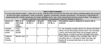
Introduction:
For this project we were asked to create a website, I wanted my site to promote my work in a professional manner and also show possible employers that my work is of a high standard. I think that creating my own online portfolio will help me not only organise my work but it could also lead to opportunities and work in the future. Before starting this unit I had no experience with using the Muse software however I had created a few websites before (in previous educational work.) I knew what a good website needed to work well and look smart although, I wasn’t too confident with actually putting a site together on a software. This unit has helped me gain these skills.
Research and planning:
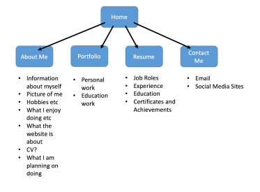
Before starting to create mt site I needed to do the correct pre-production; research and planning. I firstly analysed various portfolio websites, this helped me work out what works well, not only for a site in general but for a portfolio site too. It also helped me come up with some ideas of my won as to what I wanted to put on my own site. This influenced my ideas and overall site as I compared everything I was doing on my own site to what I saw on other peoples websites too and so overall my site looked professional because of this research. My research portfolio included creating a mood board, colour scheme, font styles and logo. Doing all of this planning allowed me to create my own ideas for my site. When doing my mood board I put a range of images (that I found from sites that I liked), together to compare and generate ideas for my own site. I also chose my colour scheme- this helped me make my site flow throughout and look professional on each page. I chose a font style I wanted to use on my site and this was massively influenced by what I saw on other site, I knew it needed to be simple but smart, and that is what I chose to use. I made sure that I created a site plan- giving a small amount of detail as to what I wanted on each page and how many pages I needed on my site. This helped me organise my site and work and I then got a clearer idea of how my site would be set out.
Creating your product:
At first I found that the software quite tricky and not very clear, however I overcame my issues buy watching the Muse tutorials that we were shown in lesson and also asking people in my lesson/ course for help when I had a problem.
The design ran smoothly throughout, the colour scheme was plain and simple also making the site flow. I made sure that each page looked the same to make my site look professional. The side banner worked properly and all the links took me to the correct page. I made sure that the text and font was the same throughout so overall each page looks very smart. I added some social media buttons to a few pages- the hyperlinks all worked and made my site look professional. On some of my pages I added in photos and slideshows- they all worked well and looked eye-catching. I went into a lot of detail in my text so I think that worked really well to communicate to my audience, as it was clear and easy to read. Overall, I think my site is really good and professional- I am happy with my final site.
When I tested my site in the browsers it all worked well: the page hyperlinks (to other pages) worked correctly, image links worked and all the video links worked etc. The only problem was that the images on the portfolio page weren’t loading as quick as the rest of the page- they took a minute or so to load. However, other than the problem with the images the site overall loaded and worked really quickly. One of the main problems I faced was that my social network sites weren’t working properly, they weren’t taking me to any page and so I had to sort this out on each page. I re-linked each of the buttons a few times and asked for help and it was sorted quite quickly. Other than this issue I didn’t really have any other problems when making my site. My original intentions were to promote my work whilst making my site look professional too. Overall I believe I met this as my site looks smart and also shows off all my work including professional and education. I am happy with my site.
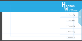
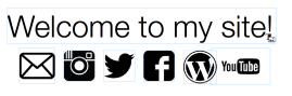
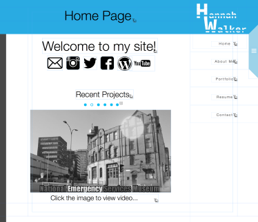
HOME PAGE: I think that my home page looks really smart and professional, the image slideshow that links to the YouTube videos work well and links to the correct videos. Also the social media buttons above the images all work correctly too and also makes the black and white theme look good as well. Overall, I like this page a lot although if I would’ve had more time I would add in a moving graphic for my background so that there isn’t loads of white space left over.
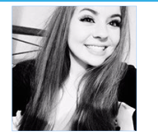
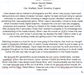
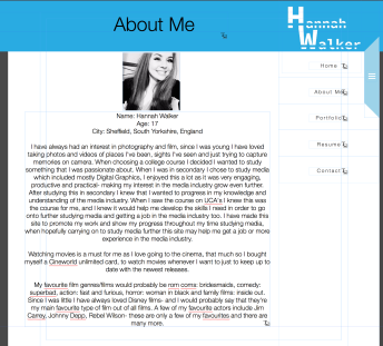
ABOUT ME: This page mainly consists of text and even though this text is detailed and helps the audience know more about me personally, I think if I had more time I would change this page so that it has more images of me on it. Generally I like this page and I believe it looks professional overall.
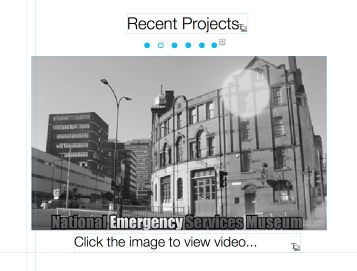
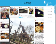
PORTFOLIO: My portfolio page is my favourite from my whole site, is it very eye-catching and makes my work (personal and educational) look professional too. I have put a range of images and videos on this page and overall I think this is the best page out of them all. Everything on the pages works including the links and buttons etc and the small amounts of text I added in brings the page together. The only thing I would change about this page would be to add more images so there is less white space showing on the page.
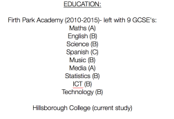
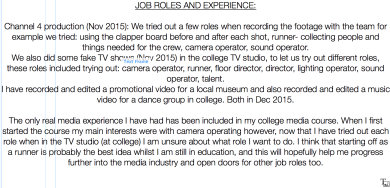
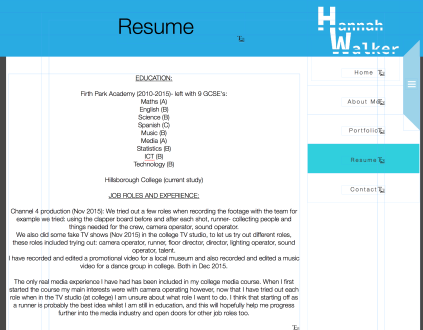
RESUME: Similarly to the about me page it consists mainly of informative text and information about my education etc. If I had more time I would change this page so that there are more images and widgets to make it more eye-catching and interesting.
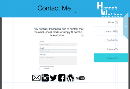
CONTACT: This page is fairly simple and doesn’t have any images on it, it works well as the buttons and hyperlinks work fine however there isn’t much on it so if I was to change it I would add in more images and widgets just to make it look more interesting.
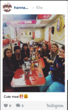
If I would’ve had more time I would’ve added in more images and widgets to cover up white space that was left on some of the pages. I would also hyperlink some images from other social network accounts, for example: Facebook- I would do this because I only linked in my Instagram images. I believe that by doing this it could’ve made this page a lot better and more professional.
Feedback:
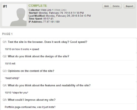
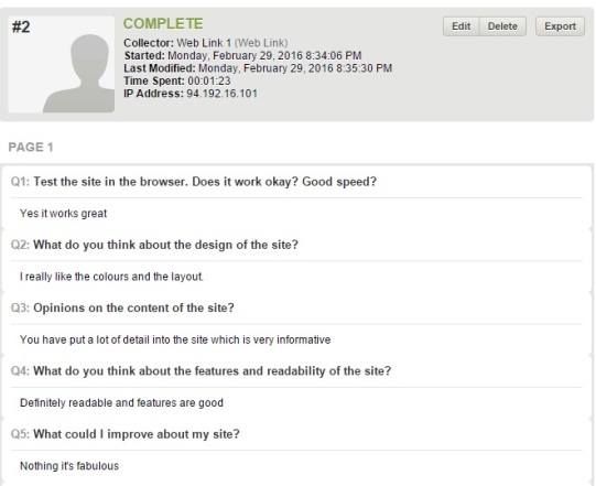
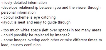
I created a quick and easy survey for my class mates to fill in for my feedback. Two people filled in this survey and another gave me a detailed paragraph instead. A few questions were skipped in the surveys however overall I got a lot of good feedback from my peers. Here (below) is the survey I created and the feedback I received.
https://www.surveymonkey.co.uk/r/HWQC252


Recent Comments